Latest activity
-
 hankscorpio replied to the thread What font is this?.https://pangrampangram.com/products/migra
 -
 Downtime resulted in a scared skeleton with a magic sword who's more up for a scrap than he is.
 -
As I keep telling you - it isn't going to work well with the details I think it's almost there. But it's still too detailed. If you...
-
Lluisfmalves replied to the thread What font is this?.Thank you! Very appreciated!
-
hankscorpio replied to the thread Logo Feedback.As I keep telling you - it isn't going to work well with the details I think it's almost there. But it's still too detailed. If you...
-
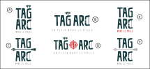
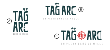
Athos replied to the thread Logo Feedback.Finaly drop the arrows out, as you said if i reduce the size it's to hard to see...So, I think I will keep this one :
-
-
hankscorpio replied to the thread Logo Feedback.I'm going to keep sizing it down - think of Social Media icons - Fav Icons Then in terms of complexity - you may not need it now - but...
-
Athos replied to the thread Logo Feedback.Work a little bit more but I think I will go more for A or B
-
-
I like these, the font chosen is good in my opinion and it would be A or B for me, C has a bit too much going on I think.
-
In my opinion - the detail is lost at certain sizes I'd focus maybe on the double as TAG ARC Make the C like a bow - but limited...
-
Athos replied to the thread Logo Feedback.Yes archery, I'm in Quebec so ARC in french is for Bow..The logo will be use in a normal size but yes agree about the fact that too much...
-
hankscorpio replied to the thread Logo Feedback.In my opinion - the detail is lost at certain sizes I'd focus maybe on the double as TAG ARC Make the C like a bow - but limited...
-
hankscorpio replied to the thread Logo Feedback.Is it archery? You say Tag Activity in the description It says Tag Arc in the options. Just wondering. Becareful of too much detail -...
-
-
 Stationery Direct replied to the thread What font is this?.I suspect it may not be a specific font and is the logo they had designed > https://versa.iol.pt/
 -
Stationery Direct replied to the thread Logo Feedback.I like these, the font chosen is good in my opinion and it would be A or B for me, C has a bit too much going on I think.